TLDR
The Oregon Ghost Conference has run on the Oregon coast for fourteen years. In the spring of 2026, its website wasn’t even loading. I rebuilt it.
Six months later the conference runs on two websites. The public one sells tickets and classes through its own cart and checkout, hands every attendee a passwordless portal with QR passes, gives every approved contributor a page of their own, and is haunted by a shadow figure that shows up when you least expect it. The private one, Mission Control, is the committee’s back office. This cycle it carried the whole application pipeline: every decision, every profile page, and 185 one-click publishes to the public site. Around that sit the rest of the event’s tools, several of them built for conference weekend and waiting for March: the vendor hall, scheduling, rosters and check-in, a door register with Tap to Pay, press kits, surveys, payouts, the conference’s own email inbox, a read-only AI assistant, and a tab where the founder can edit the public website by talking to it.
The two are joined by plumbing. One click turns an approved application into a live public page in about one to two minutes. This post walks through every room and every pipe: what it does, why it exists, what broke, and what any event organizer should steal.
At a Glance
| Client | Oregon Ghost Conference, Seaside, Oregon: a paranormal conference with around a thousand attendees and around a hundred vendors a year, 15th annual in March 2027 |
| Starting point | A website that wasn’t loading |
| What got built | A new public website, a second private web app (Mission Control) that runs the event and publishes the first one, 29 serverless functions, an email router, and a door register |
| Timeline | First session March 17, 2026; first commit March 30; Mission Control’s first commit May 5; still shipping in late September |
| Commits | 1,421 across two repos (949 site, 472 Mission Control), on 85 different days |
| Stack | Astro, Cloudflare (Pages, Workers, Email Routing), Supabase, Stripe, Resend, a Git-based CMS, and Claude models inside the product |
| Team | Me, plus an AI team: a lead agent that owns every merge and deploy, parallel builders, and adversarial reviewers from a different model family |
| Live site | oregonghostconference.com |
What They Had
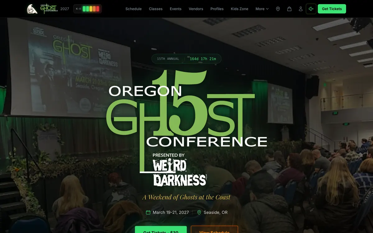
The first thing I did was a due diligence pass on the conference’s whole footprint, the week after their spring 2026 event. The first finding was simple: the website wasn’t reachable. The server timed out.
When you could reach it, you got a basic site-builder page sitting on infrastructure from around 2012. Around a thousand attendees a year. Around a hundred vendors. Sponsorships that sold out. And a web presence that didn’t reflect any of it: beloved in person, nearly invisible online, with no video channel after fourteen years, and an operation that ran on Facebook posts, PDFs, and a lot of knowledge that lived with a few key people.
Behind the website, it looked like this:
- Applications were a PDF from 2019, a separate one for each role, plus Facebook messages that never got matched against the email list.
- Tickets and classes were sold on an outside booking platform. Every sale left the conference’s own website.
- Door sales ran through a separate card reader, so the weekend’s ticket count lived in two places.
- Class rosters were printed, phoned, or emailed one at a time.
- The vendor hall was laid out on paper.
- Instructors were paid by check, by hand, after the weekend.
- Directions to rooms lived in people’s heads. In the data I pulled off the old site, none of the off-site venues had a street address.
- Flyers didn’t always carry the website address, and there was no press kit at all.
- The conference’s email lived on an old hosted mailbox tied to a legacy hosting account.
The line from my due diligence report that stuck with me: “You don’t need more attendees. You need the same attendees spending 3x more and staying connected 12 months instead of 3 days.”
That became the brief. Not a prettier website. A system that holds the conference together for the other 362 days of the year.
Data First, Design Second
The first session didn’t touch design. It pulled every piece of real content off the old site (schedules, vendors, classes, sponsors) over plain HTTP, because the site’s secure connection was broken and the web archive was blocked too. That way the client never saw a single placeholder. The first preview they looked at had their own vendors and their own classes in it.
Then I had a team of AI agents research the vendors themselves: 81 parallel research agents in batches of 10, 20, 20, and 31, each filling out one vendor’s profile from their public footprint. A few weeks later I pulled part of that back. The agents had found social links and websites the vendors had never given the conference. Profiles kept the bios and images; the links nobody had handed us came off. Being able to find something isn’t the same as being invited to publish it.
The stack is the same boring, fast one I use everywhere: Astro, hosted on Cloudflare, a Git-based content editor so a date can change without a developer, Supabase for anything dynamic, and Stripe for checkout on the conference’s own account.
One early call set the tone for the whole project. The first hero effect used Three.js, a 3D library that weighs about 150 KB. My AI team flagged something I hadn’t thought about: the people loading this site are often sitting in a hotel room in a small coastal town, on hotel Wi-Fi. The effect got rebuilt in plain Canvas 2D at about 3 KB.
My reaction at the time, word for word: “Dude, good thinking about what it would be like if you were trying to load the site when you’re at a hotel and seaside. That’s fucking genius.”
Design for the network your audience actually has, not the one you’re testing on.
How a Website Rebuild Became an Operating System
Nobody sat down in March and said “let’s build an event operating system.” It grew, one real problem at a time. Looking back, the scope changed at six specific moments.
1. Day one of git. The first commit was a ten-page website. The same day, the content editor went in, and the notes already listed a flyer system and a brand kit. The ask was bigger than a website before the first line of code shipped.
2. The cart that didn’t exist (April). The outside booking platform could only sell one thing per checkout. Fixing that meant building the conference its own cart, which pulled the site into payments, seat capacity, waivers, refunds, and confirmation emails within a week.
3. The 2 AM edit (April). At our first long in-person meeting, the conference’s founder and director explained when edits actually happen: in the middle of the night, a misspelled name, a price change. If those changes needed a developer, none of the rest was worth it. That one need runs through the whole project, from the content editor in March to Site Builder in September.
4. One dashboard (May). In early May I recorded a solo voice memo that, looking back, is the birth certificate of Mission Control: “each of these pieces of the puzzle from surveys to emails to payment processing. The waivers that need to be done. All these things should be viewable through one dashboard because we need to make this easy for [the founder].” Mission Control’s first commit came three days later, and versions 1.0 and 1.5 shipped the same day.
5. The committee sees it (June). A live walkthrough with the committee on a video call, with accounts created for each of them on the spot. That’s when “the website” turned into a shared tool: per-item approvals, waitlists, surveys, flyers, a roster that wasn’t on paper.
6. The rest of the operation moves in (July to September). The application pipeline, the vendor hall, the conference’s email, the door register, and finally the website editor itself.
The same memo has the line I’d put on the wall of every client project:
“The goal is not to replace everything or make people feel inferior. It is to make them feel like they are more capable than they were before because we just made certain things a lot easier for them and freed up their time and lowered the amount of stress that they have to deal with.”
That’s the real definition of an operating system for a small organization. Not software that does the work instead of the people. Software that makes the people who already do the work feel bigger.
The Haunt: A Website That Hunts Ghosts
The signature of this site is that it’s a little haunted. Not a theme. A system: nine separate pieces load on every page, each with its own timing rules, and every moving one switches itself off for anyone whose device asks for reduced motion.
None of it was in the brief. It came out of a research pass where I had a group of AI agents study the brand through the audience’s own vocabulary: what ghost hunters carry, what they talk about, what they’d recognize instantly.
A nav bar that hunts ghosts
The nav bar has an EMF meter in it, modeled on the K-II meters ghost hunters actually carry: five LEDs, green, green, yellow, orange, red.
- On a computer, it reacts to your cursor. Get within 240 pixels of something clickable and one LED lights. Within 30 pixels, all five are lit. Stop moving for three seconds and it settles back to zero.
- On a phone, it reacts to how fast you scroll. A gentle scroll lights one. Fling the page and it pegs red, then decays a moment after you stop.
Anyone in that community recognizes the instrument instantly. It was born in the bottom corner of the screen and moved into the nav, next to the logo, the same day, because it felt like part of the brand instead of something bolted on.
My review note on that idea: “The EMF detector is such a cool idea!!!! love this!!”
The same research pass also proposed a cursor smoke trail. We built it, looked at it live, and killed it, because it fought with the meter for attention and felt, in my words at the time, “elementary”. Knowing what to take out is half the job.
The apparition
Then there’s the shadow figure.
In an early May voice memo, I said this about it: “I still haven’t done the shadow figure addition to ways that the website’s haunted, but that’s more a Easter egg type of build, so it’s not very important.”
It became the most rebuilt piece of the whole project.
Today it works like this. A shadowy figure eases out from the edge of the screen, holds there watching you, and then rushes toward you and is gone. It runs on a site-wide clock of visible time, so it’s rare on purpose:
- Your first sighting comes somewhere between one and three minutes into your visit.
- After that, five to twelve minutes of time on the site pass between sightings.
- Moving between pages doesn’t reset the clock. A hidden tab pauses it. Two open tabs can’t both fire it.
- The animation frames only download 20 seconds before a sighting is due, so the ghost costs almost nothing on a visit that’s too short to see it.
The rarity was a change of heart. In August I’d asked for it on every page view. By September I reversed myself: “way less frequent… randomized with much longer time between appearances… not unless you’ve been on the site for at least a minute… should not reset the clock every time you go to a new page.”
A ghost that shows up every time is a pop-up. A ghost that shows up when you’re not expecting it is a story people tell their friends.
It has a second act now, too. My brief, word for word: “Just a peek around to see if anybody’s looking, and then just shooting over to the other side with some smoke plumes hitting the wall that he goes through. When I say wall, I just mean the other side of the screen.” On each sighting the site picks one of the two acts at random, and a random direction.
Phones get their own vertical version of the dash. Stretched across a 390-pixel phone screen, the wide version left the figure about 175 pixels tall, and an AI video reviewer failed it on both test phones for getting lost next to the sponsor cards. The phone take puts the figure at about 480 pixels tall on an iPhone.
The ghost that wouldn’t lunge
That apparition went through six different architectures in under three months, and it taught me the most important QA lesson of the year.
- June: a static watercolor figure that slid in from the right edge.
- July: a video of the figure peeking out from behind the site’s glass cards, blended onto the page.
- July, again: the blend only worked over dark backgrounds. Over the bright hero photo, the video’s black backdrop showed up as a rectangle. So it became a video with real transparency. Safari couldn’t play that kind of video at all.
- Late August: a new performance, peek, hold, and lunge, with the figure’s hand gripping the edge of a card. That meant drawing the figure twice from one clip, the body behind the card and the fingers on top of it.
- The next day: moved to the edge of the screen, with a codec ladder (a different transparent video format just for Safari, with a fallback behind it). Then a faint white haze appeared around the figure, but only on a real iPhone, never on a Mac. The cause was near-invisible smoke pixels surviving compression. The fix was clearing every almost-transparent pixel to fully transparent at the source file.
- The day after that: I asked for the frames to be delivered in “a better, more universally usable format that works on both iPhone and Android.” So video went out entirely. Each side is now one animated image with real transparency, 84 frames at 18 frames per second, that plays once and ends on a fully transparent frame so it clears itself. It plays the same in Chrome’s and Safari’s engines.
Here’s the lesson. During step four, the test harness staged the apparition 174 times with zero rule violations, on top of 80 natural sightings, and four rounds of external review. Every measurement passed. And the thing we shipped couldn’t lunge. The performance got cut off at 2.6 seconds, and the lunge started at 3.2.
I caught it by watching the live site. The commit that fixed it says: “174 stagings with zero invariant violations told me nothing about whether the thing looked right or even played to the end. Watch it.” The note in the project file now reads: “Measuring invariants is not QA. Watch the thing play, end to end, before claiming it works.”
Since then, the apparition gets recorded in a real browser, and a second AI model watches the recording and judges it before anyone calls it done. The final version of the dash passed that review on five screen sizes, from an iPhone to a 1920-pixel desktop.
Everything else that goes bump
- A planchette with a mind of its own. A real wooden planchette drifts onto the page, wanders, then glides to a random nearby button and hovers over it, like it’s reading the letters. Bring your cursor within 160 pixels and it flees. On a phone, a tap spooks it.
- The site itself is haunted. Every minute or two, with no warning, a card flickers with TV static, a line of text scrambles, or a sentence dissolves into static particles that float up and get pulled back into place. Never in the first ten seconds of a visit, and never near a button you’re about to press. Haunted, not broken.
- Sound, off by default. Five haunted sounds (a slowed-down baby’s laugh I bounced in Pro Tools, a haunted elevator, heavy footsteps, footsteps and a door, and a clink) play in a shuffled order so none repeats until all have played. Sound used to be on by default. Then, on a call with the founder, I said “we need to lower the audio by, like, 50%. And space it out a lot more”, and the next day it went to off-by-default, with a glowing speaker icon in the nav on your first visit so you know it’s there.
- Easter eggs. Enter the Konami code and every LED on the meter lights up: “Evidence Collected. Spirit Detected. EMF Level 5 // EVP Class A.” Between 10 PM and 5 AM your time, the fog gets thicker. And there’s an ASCII ghost hiding in the page source with a note: “if you can read this, you’re closer than you think.”
- A 404 page that’s in on it. “This page has ghosted you.”
- The Shadow Raffle (built, switched off). Catch the figure with a click or a tap and you can enter a raffle, once per day. It’s free to enter and never tied to a ticket purchase, deliberately, because paid raffles are a regulated thing.
What we took out
The research pass proposed more than we kept. Text that quietly corrects itself. A favicon that watches you. A “cold spot” so subtle almost nobody would notice it. I turned the first two down on values, not taste: “I don’t really want to change words” and “there’s already enough surveillance in the world.”
The filter that came out of that conversation is a good one for any brand: does this feel like a ghost, or like a system? Ghosts are welcome. Systems that feel like they’re watching you are not.
Front of House: An App for Every Kind of Visitor
The public website looks like one site. It’s really several small apps sharing one look, one database, and one sign-in pattern, each built for a different kind of person who shows up.
For attendees: a portal that works in a basement
Every ticket buyer gets a portal with no password, ever. You type your email, you get a sign-in link, and you land on your own weekend:
- Your schedule by day, with what you paid for each class.
- A QR entry code for each class.
- A PDF of your whole weekend, generated on the server, with an entry QR for each class, for people who like paper.
- Calendar files for one class or the whole schedule, in Pacific time, with a 30-minute alarm built in.
- Overlap warnings if two of your classes collide.
- Walking-time hints between back-to-back classes at different venues, telling you how many minutes’ walk the next venue is and to head out right after this one.
- Read-aloud directions to every room.
- Gift a seat. Send a friend a link or let them scan a QR off your phone. They accept it on the claim page, signing their own waiver if it’s an off-site investigation.
- Offline mode. Convention centers have bad signal. If you lose connection, the portal shows your last saved schedule, and the entry codes still work.
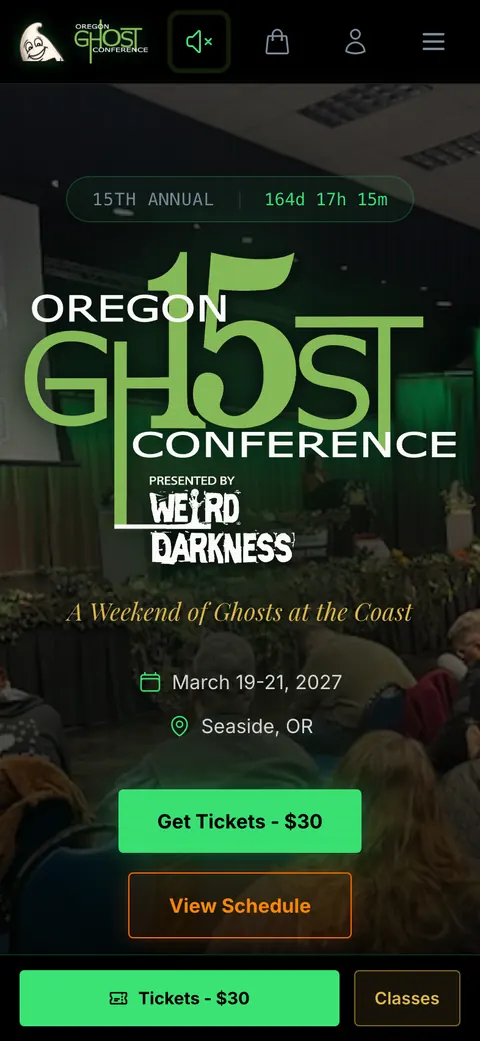
You can also install the site on your phone’s home screen like an app, and it caches the schedule, the map, and your portal for weak signal.
For vendors, speakers, and instructors: one door
Contributors get their own portal with the same passwordless sign-in. A vendor, an instructor, and a host all sign in at the same door and see what’s theirs: their profile and whether it’s live, sales totals for the classes they teach, how many people scanned their flyer QR codes, their payout running total, and a printable roster for each class (names and ticket type only).
It shipped in August. Six days later we noticed it had no front door: every approved contributor had a dashboard and no way to find it. The sign-in card now sits on the attendee login page too.
For everyone who gets lost: the map and room finder
The map shows all six venues and five partner hotels, your own position as a blue dot, and the convention center’s floor plan laid over the street map when you zoom in. Below it, Find Your Room has turn-by-turn directions from the main lobby to every room, grouped by floor, each with a Read aloud button:
Go up the stairs, turn left, and go up the second flight of stairs. Head down the hallway. Riverside Room A is the first door on the left.
Those directions are edited in Mission Control in plain language and served live, so a correction reaches every phone in the building within minutes, without a deploy.
There’s also a booth-numbered floor plan of the vendor hall. On phones it scrolls sideways at a readable size instead of shrinking to fit, because at fit-to-width a booth number was two pixels tall.
For the people of the conference: a page each
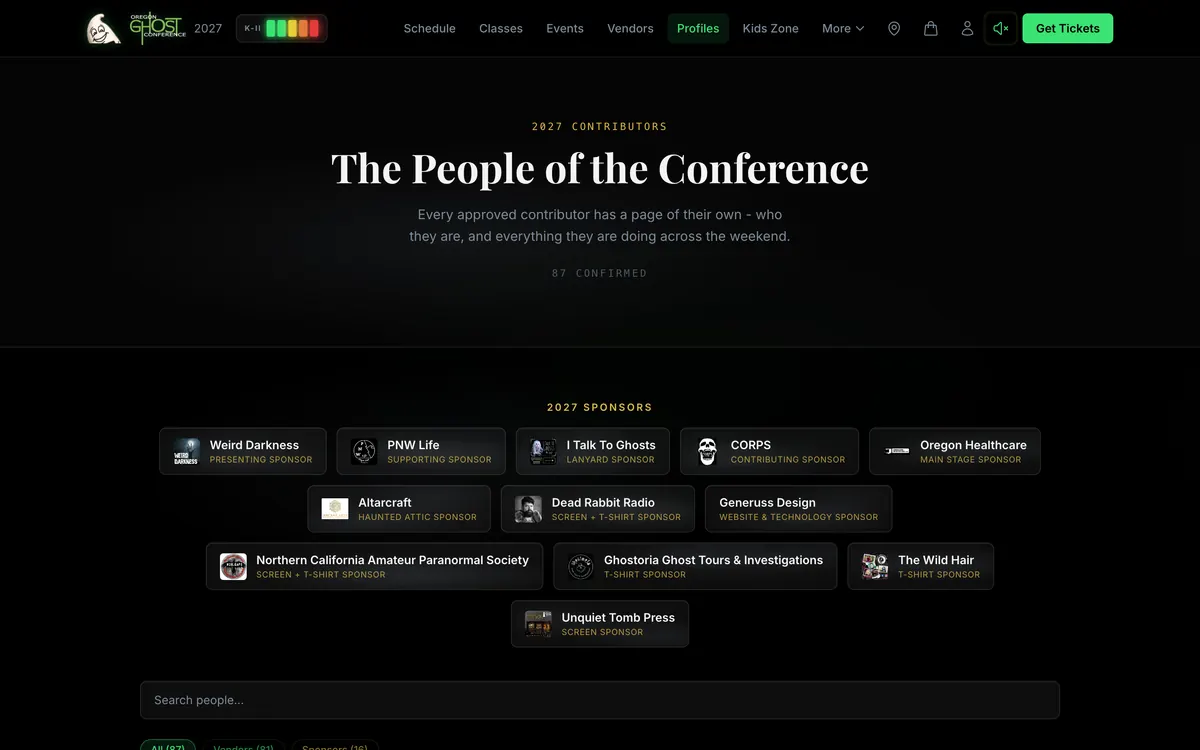
Every approved contributor gets a page about them as a person, separate from their business listing, with every booth, class, and talk they’re doing linked together. Vendors and sponsors are live now; speakers and instructors join them when the lineup is announced. The profiles hub is searchable by name, business, products, bio, and booth number.
Two details I care about here. First, each person page says where its bio came from, because only speakers and instructors are asked for a personal biography; presenting a business blurb as someone’s personal bio would have been, in the words of the commit, “a small lie repeated on 49 pages.” Second, every profile opens on a full-width banner: the person’s uploaded header if they have one, otherwise their own photo, blurred and tinted, ghosted in on the right like an apparition. Every banner’s text was checked for contrast against accessibility standards.
For families, shoppers, and the hungry
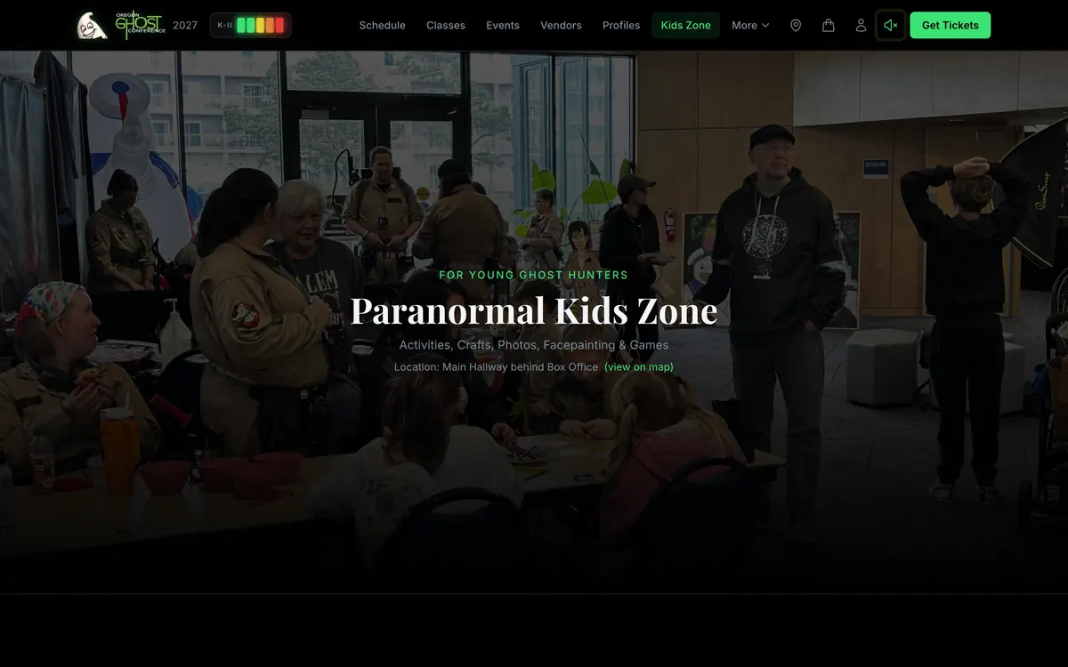
The Paranormal Kids Zone page (face painting, crafts, games, and the local Ghostbusters chapter), the raffle, merch, and concessions each got their own page, most with real photos from the convention floor. The Kids Zone page also sells its own sponsorship, wired straight into the application.
For anyone who hits a snag
A Report an issue link sits in the footer of every page. It asks what happened and which page you were on, and it lands as a ticket in Mission Control instead of in someone’s personal inbox.
Replacing the Payment Processor Without Breaking a Single Sale
This was the riskiest move in the whole project, and the one I’d point to first if someone asked whether I can be trusted with a real business.
What the old system did
Every ticket, class, tour, and investigation was sold through an outside booking platform. The website linked out to it. So a person who found the conference online had to leave the conference’s website to give it money.
The platform’s booking flow took one product per transaction. No cart. Someone who wanted general admission and three classes checked out four separate times, on another company’s pages, and clicking “Book” on the old site often landed on that platform’s generic class list instead of the class they’d picked. The fees were passed on to buyers. The buyer list lived inside someone else’s system. Door sales ran through a separate card reader, so the weekend’s ticket counts were split across two systems. And instructors were paid by check, by hand, at the end of the weekend.
The strategy: move the experience first, the money second
A rip-and-replace on a live event’s payments is how you lose a weekend of sales. So I didn’t ask the client to make that call up front.
Instead, I built the conference’s own cart and checkout as a front end that could sit in front of either backend: the same cart, the same conflict detection, the same checkout flow, whichever system was taking the money behind it. The line in the project notes that week: you migrate the experience first, the backend second.
Then it happened in stages:
- Shadow build (April). The new cart and checkout got built while every live booking link still went to the old platform. Then the site’s booking links were rerouted into the site’s own cart.
- Side by side (April to June). The cart offered both: the new checkout, and a step-by-step checklist for the old one, one page per item. The founder could walk both funnels end to end and feel the difference instead of reading about it. After an in-person meeting, the founder blessed killing the old one.
- New checkout only (June). The old button left the cart. One legacy tour stayed on the old platform for a while on purpose.
- Test mode (June to July). Everything ran against test cards while the conference’s own payment account got set up.
- Live on the conference’s own account (July 31). Built and tested on a development account, then moved to the conference’s own Stripe account before the first real sale, so no live money ever had to be migrated.
- Full retirement (August 20). Every last trace of the old platform came out of the site’s code, the content system, the security headers, and the structured data search engines read.
By the time the switch actually happened, it was a configuration change, not a redesign. Buyers never saw it.
The hardening day
Before a single real dollar moved, the purchase flow went through one long day of adversarial review: twelve rounds with an AI reviewer from a different model family whose only job was to break it, and a live test suite that grew from 52 checks to 121, run against the real deployed functions with signed test events and real database state.
The review rounds found problems no happy-path test would:
- A payment that hadn’t actually settled yet (some payment methods take days) could have been treated as paid.
- A retry from the payment provider could have been swallowed, so a dying first attempt would never get a second chance.
- An abandoned checkout session could still have been payable after the buyer started a new one.
- Two of my own fixes fought each other: a cleanup step was deleting the exact record a crash-repair step needed.
All fixed before launch. That suite has since grown to 122 checks, and it now cleans up every test checkout session it creates.
How a ticket gets bought now
Here’s the whole path, start to finish:
- Add to cart from the schedule, a class page, a vendor profile, or the tickets page. The cart lives in the browser, so nobody needs an account to shop.
- The cart flags time conflicts between classes, adds general admission automatically when you buy a class (you need a pass to get in the building), and asks for a waiver signature on off-site investigations and tours.
- Checkout builds the order on the server. Prices come from the database, never from the browser. Seats get reserved atomically: every seat in the order or none of them, with locks taken in a fixed order so two buyers racing for the last seat can’t both win and can’t deadlock each other. That race was tested live with two buyers at once.
- The payment page is Stripe’s: cards, wallets, Link.
- The confirmation comes back as a signed event. It’s verified, recorded exactly once, and turns the held seats into confirmed seats. The confirmation email is sent exactly once too, with two separate locks on it.
- The buyer’s email has a “View your schedule” button that signs them straight into their portal. No password, ever.
There’s no product catalog to keep in sync, either. Every checkout line is built from the database at the moment of purchase, so changing a price is one update in one place.
Seats are rows, not counts
This sounds like a database nerd detail. It’s actually the decision that made half the attendee features possible.
Most ticketing systems store “3 seats sold”. This one stores three seats, each its own row, with who paid for it and who currently holds it. Because of that:
- Gifting just works. Buy three seats, send two to friends with a claim link. A gift moves who holds a seat; it never creates one, so capacity can’t be gamed. If the class is an off-site investigation, the friend signs their own waiver when they claim.
- Every seat has its own QR pass, its own price paid, and its own check-in.
- Rosters fall out for free. An instructor’s roster is just the seats for their class.
- Refunds and disputes sync back from the payment provider, and a refund total can only go up, so an older event arriving late can’t shrink it.
The door register
The last piece was the front door of the convention center, where walk-ups buy passes. The founder wanted the weekend’s ticket count in one place instead of split between a card reader and a website.
So Mission Control has a door register built for a phone or an iPad. A volunteer can sell four ways:
- QR “pay on your phone”: the buyer scans and pays on their own phone.
- Card on this device: the buyer types their card into the volunteer’s screen.
- Cash: recorded in the register, with a cash-in-drawer total at close-out.
- Tap to Pay: the card is tapped on the volunteer’s phone in Stripe’s own app, and the register claims that exact payment.
The Tap to Pay design is my favorite small trick in the whole project. Instead of wiring up card-reader hardware, the money is taken in the payment app the volunteer already has, and the register claims it: only a payment made after this sale reached the tap step, for exactly the cart total, in person, under 30 minutes old, not refunded, not already claimed by another register, and matching the last four digits the buyer reads off their card. The database allows exactly one claim per payment. The seat is held from the moment the tap starts. And if a tap charge somehow can’t be finished, it’s flagged “charged, refund owed”, never dropped.
Every door sale goes through the same fulfillment code as a website sale. When that code was pulled out into one shared piece so both could use it, an A/B harness ran the old and new versions side by side against the real database and compared every reply, row, email, and payment call: 10 out of 10 identical.
The register shipped in late September after two separate review rounds, which found and fixed real problems: a cash sale that could be recorded twice if a reply got lost, a tap payment another register could have claimed, and a seat that could sell out from under a tap in progress. It’s built, deployed, and waiting for March.
Paying the people who teach
Instructors earn a share of their class sales (the public application says instructors keep 50% of class fees). Mission Control’s payouts page computes every instructor’s share live from the actual seats sold, so the number can never go stale, and records each payment made with a correction trail that voids instead of deletes. Instructors see the same math in their own portal. Moving the money itself is still a deliberate human step.
The safety net under all of it
A reconciler compares every order in the database with what the payment provider says happened: missed completions, amount drift, stale holds, refund drift, disputes, unsent confirmations. It runs as a dry run by default and refuses to run at all against the wrong payment account. Going live was one command whose dry run names the account out loud and refuses to proceed unless that account can actually take charges and pay out.
That’s the part I’d want a client to understand. The checkout is pretty. The reason I sleep at night is everything around it.
The Schedule: Building a Three-Day Program Without a Spreadsheet
A conference schedule looks like a table. Behind it is the hardest scheduling problem most small events ever face: dozens of classes, a Main Stage, evening events, off-site investigations, a handful of rooms, instructors who teach more than one thing, and attendees who want to get from one room to the next without missing the start.
From approved class to class page
Approving someone’s class and putting it on the schedule are two separate steps, on purpose. An approval says “yes, we want this.” A session is something that can hold a day, a time, and a room. Keeping them apart means a misclick on an approval costs nothing.
Once a class approval is published, it shows up in an “incoming” lane on the Classes board in Mission Control. One click (or Add all, which shows a dry-run count first) turns each one into a draft session that carries the instructor’s own words from their application: the description, the class length, and what attendees will learn. Nobody retypes a class description. The heading on the public page even reads in third person, because every answer to that form question was written as “They will…”.
Then the committee schedules it: day, time, room, price, capacity, co-presenters. Every one of those edits is logged, and a few rules fire on every save:
- Same room, overlapping times: refused.
- Different rooms, less than ten minutes apart: allowed, but it asks you to confirm.
- Moving a class to a new day moves every field that encodes the day together. (A class once got perfectly scheduled and still never appeared, because only one of the three day fields had moved. That’s fixed for good now.)
That ten-minute rule didn’t come from me. It came from the post-conference attendee survey, where people said overlapping sessions made them late. More on that loop in a minute.
When the schedule is published, Mission Control commits it to the public site the same way it publishes profiles. The commit message doubles as a human-readable report: how many classes, speakers, and evening events, which presenters are linked, what got skipped and why. It refuses to publish an empty program over a full one.
”Approving is not announcing” applies to classes too
There are two separate switches on the public site. One says the class lineup is forming: each approved class that has been added to the program gets a page that says “Confirmed for 2027, day and time coming soon”, with the description and what you’ll learn. The other says the timed program is live: classes get their day, time, room, and an Add to Cart button.
Right now, the first switch is on and the second is off. The 2027 lineup is forming in public while the founder builds the grid.
Taking a class back
The hardest code to write was the undo. If the committee un-approves a class that’s already on the schedule, what should happen?
- If it’s an untouched draft, it’s removed quietly.
- If someone already scheduled it, the system asks before undoing their work.
- If anyone has bought a seat or joined the waitlist, it flatly refuses.
And it checks all of that before changing anything, so nothing is ever half-undone. That logic deletes real rows, so it ships with 31 offline tests.
The schedule solver (built, switched off)
The founder is building the 2027 schedule by hand, and the plan is to record that reasoning so it can teach a solver for 2028. The solver already exists: it reads the rules pulled out of the founder’s own planning recordings, pins anything a human already placed, fills in the rest, and explains every placement it made. It never touches the real schedule. It only proposes a draft copy for a person to adopt.
On real data, it rebuilt the 2026 program with zero hard rule violations and placed every one of the 2027 approvals. It’s switched off this year, with a live demo copy, while the founder builds the 2027 grid by hand. The person who knows the attendees makes the call.
The Day Of: Rosters, Check-In, and Passes
On conference weekend, three different people need three different things.
The attendee has the portal described above: a QR pass per class, the PDF of their weekend, calendar files, read-aloud directions, and offline entry codes.
The instructor has a printable roster for every class they teach, names and ticket type only, in their own portal. A person who doesn’t own a class gets the exact same “no” as a class that doesn’t exist, so the portal can’t be used to go fishing.
The committee has a live roster in Mission Control that refreshes every 15 seconds and three ways to check someone in, all writing to the same record:
- Scan the attendee’s pass. The QR is signed and verified on the server. Scanning someone twice just shows when they were first checked in.
- Tick them in by hand, with an undo that keeps the history.
- Let them check themselves in. Each class gets a printed door sign with a QR code. The attendee scans it with their phone, and if they hold a seat and it’s within the window (90 minutes before start until the class ends), they’re in. If the system can’t work out the time window, it fails closed instead of letting anyone in at any time. Every class has its own off switch.
Class reminders go out the day before and right before each class. They’re live, and asleep until conference week.
Surveys: How the Conference Listens
Surveys are easy to send. The hard part is what happens after: responses pile up in a list nobody has time to read.
Mission Control turns survey responses into decisions:
- Season surveys for attendees, contributors, and vendors land in Mission Control, where an AI model reads each response and pulls out the topic, a one-line summary, and a verbatim quote. A plain code step then merges them into topics ordered by what needs action first: pain points, confusion, suggestions, questions, hopes, and wins. Every response is classified exactly once, and the counts are recomputed from the source every run, so the page heals itself.
- Per-class surveys get their own link, printed as a QR for each room. Each response is matched to the seat, one per seat, and resubmitting edits your answer instead of stacking duplicates. If someone without a matching seat fills it out, the form still thanks them. Feedback forms should never argue with the guest.
- A day-after email with a survey link for each class you attended is built and switched off, waiting on the committee’s call.
And the loop closed at least once, visibly: the post-conference attendee survey said overlapping sessions made people late. That became the ten-minute buffer rule, built into every class-time save. That’s the whole point of a survey. Not a report. A rule.
Press Kits That Build Themselves
The conference’s biggest untapped marketing channel is the 80-plus vendors, speakers, and instructors who each have their own following. Every one of them wants to post “I’ll be at the Oregon Ghost Conference!” Most of them don’t have a designer.
So the application asks one simple question: do you intend to promote the conference? And Mission Control has a flyer engine to back up the answer.
The background library
First came the art. Using an AI image model, I generated a library of flyer backgrounds across:
- 10 themes matched to the kinds of people who come to this conference: witchy, crystals, cryptids, divination, healing, animals, ghost teams, graveyards, book and class nerds, and a catch-all.
- 3 styles: photorealistic, cartoony, and rustic.
- 5 sizes: square for feeds, 4:3, a printable 8.5 by 11, widescreen, and a 9:16 story.
The library holds 215 background images, including alternates. Each contributor’s theme is picked automatically from their category and their own description of what they do, and the committee can override it.
How a contributor gets their flyers
- The contributor gets a private link.
- The contributor opens it, picks the looks they like, and checks their details.
- Mission Control composes each flyer: the background, the contributor’s own photo from their application, their name and business, their class or session, the real conference logo, and a QR code.
- A person reviews the result and sends it. The contributor gets one email with grouped download links for every size.
Press kits also ride along as attachments on the committee’s acceptance and scheduling emails, from a private storage bucket, and a send refuses to go out if any attachment can’t be downloaded.
The QR codes are the clever part
Every flyer’s QR code is a short link on the conference’s own domain. When someone scans one, the site logs the scan, privately (the type of device and the referring site, no IP address, no cookies), and forwards them on with the right tracking tags attached.
That means the conference can see which contributors actually drive people to the site, and each contributor can see their own scan count in their portal. A flyer stops being a favor and becomes a scoreboard.
It’s built and proven end to end, from the private link to the delivered flyers. The point is the timing: the moment the lineup is announced, every presenter has something beautiful to post within minutes.
Mission Control: The Second Website
If the public site is the front of house, Mission Control is the room behind the room. That’s literally the subtitle on its login screen. If you try to open a page your role doesn’t allow, the error page says “Not your room.”
It started as a dashboard. It’s now a second, private web application that’s bigger than the public website it runs:
| Public site | Mission Control | |
|---|---|---|
| Screens | 40 page templates, 291 built pages | 50 screens |
| Server functions | 29 edge functions | 146 API endpoints |
| Lines of source code | about 28,000 | about 71,000 |
| Commits (to Oct 1) | 949 | 472 |
| First commit | March 30, 2026 | May 5, 2026 |
Both share one database (71 conference tables). Every write in Mission Control lands in an audit log with a before-and-after; that log has passed 3,900 entries. There are seven roles that stack on one person (admin, operator, committee, crew, vendor, instructor, photographer), and the sidebar shows each person only what their roles allow.
The most important number is this one: 208 of the public website’s 949 commits weren’t made by a developer. They were made by Mission Control’s Publish buttons. Every time the committee publishes a profile, a staff bio, an ad, or a rate card change, Mission Control commits it to the public site, and the site rebuilds itself. (The schedule goes out the same way.) The website is operated from the dashboard.
To be straight about this cycle: the application lane did the heavy lifting. Every decision, every profile, and every publish ran through it. Much of the rest is built for conference weekend and waiting for March.
Here’s the tour, in the order the work flows.
The cockpit
The first screen after login. For the people running the conference, it’s an alerts strip (budget overrun, overdue payments, ticket sales falling behind pace, and silent when everything’s green), seven live tiles (applications waiting on a decision, sales, the three emptiest classes, the profile pipeline, new survey themes, open support tickets, promo scans this week), and a “What I noticed for you” card.
That card isn’t AI. It’s plain database queries: reliable, cheap, and just as useful. And every tile has a time budget: a slow tile becomes an empty tile, never a broken home page. (That rule exists because a slow tile once hung the landing page and locked people out.)
Applications
The heart of the system, traced hop by hop in the plumbing section below: every application split into separately decidable items, drafts until published, the oversell guard, and sub-pages that grew out of real mornings. Crossings untangles businesses with several applicants and classes taught by two people, using answers the form had been collecting since day one (“Will you have a co-instructor?”) that nobody had a way to use. On its first run it found nine knots, including eight joint sessions and two people teaching with no application of their own, which meant no page and no way to get paid. Deleted restores anything removed by mistake.
Profiles and the vendor hall
Two tabs that used to be one. The committee drew the line in a meeting: Profiles is for the people, Vendors is for the booth businesses.
Profiles is where approved applicants become public pages: draft, ready, published, with a live preview that matches the public page, photo slots filled from the applicant’s own uploads (phone photos too big? one-click resize; iPhone HEIC files convert right in the browser), a person bio separate from the business bio, and every role they’ve earned. Returning businesses adopt last year’s page instead of getting a twin, and a merge never deletes anything: the extra page is archived and points at the one that survived.
The vendor hall is built to replace paper. The booth layout had been done on paper because no screen could answer “who’s on booth 42?” Now it’s one row per booth business with the booth number editable in place, what they asked for, their placement request, and whether their page is ready. Two vendors on one booth turns both rows red as you type. One button publishes booth numbers to the public profile pages and the directory search.
Classes, speakers, events, tours
The scheduling side, covered above in the schedule section. The grid is built so every cell navigates: the title opens the class, the instructor opens their profile, the room opens the floor map with that room highlighted. Fill meters run red to green, because full is the goal. Capacity can’t be lowered below seats already sold. Speakers have their own board, because at one meeting the committee asked a fair question: where are the speakers? Tours and investigations sit with their waiver coverage: who signed, who hasn’t, and signatures that don’t match a current registration.
Roster, check-in, and the door
The live roster, the three ways to check someone in, the printable door QR signs, and the door register for walk-up sales. All covered above in The Day Of and the door register.
Locations
Every room on the real floor plan with a pulsing marker, a spoken-style walkthrough, and a step-free route where one exists. The editor is plain language, checked against the venue’s room list. Edits reach the public map and every attendee’s portal within minutes, with no deploy, because this one table is read live.
Room knowledge used to live with a few people. Which room has round tables, which has rows, how to get to the Bridge Tender from the convention center. Now it lives here.
Press kit and promotions
The flyer engine from the press kit section above, plus a Promotions board that answers a question from the founder’s very first list of pain points: are vendors actually promoting the conference?
Each contributor gets a transparent 0 to 100 score: recency, QR scans, how many channels they use, how complete their profile is, and payment, with the arithmetic shown right on the card. Nobody gets a mystery number.
Ads, sponsors, and the rate card
The rate card is one source of truth. Prices, quantities, and permanent IDs live on the public site; “sold” is counted from approvals in Mission Control. Neither side copies the other, so they can’t drift. An approval counts as sold even before it’s published, because double-selling a one-of-a-kind sponsorship costs more than briefly under-advertising one.
Before this, sales were recorded by typing free text into a notes field, which no machine could read, so the public apply page kept offering spots that were already gone.
The Ad Studio next door is where a sponsor’s actual ad gets staged: the creative, the tier, the placements, the click-through, a preview of each placement, then one button to publish it to the site. Inventory and creative are deliberately separate pages, so neither has an opinion about the other’s numbers.
Financial and payouts
A finance command center for the event: an executive summary, sales pace against a curve with an alert when it falls behind, budget lines and expenses, money owed from approved-but-unpaid application items, exports (books, per-section spreadsheets, a printable board report), and a refund button.
Payouts computes every instructor’s share live from real seat sales, never stored, so it can’t go stale, and records each payment actually made, with corrections that void instead of delete.
One quiet rule underneath: whether a sale is a test or real is decided in exactly one place, by the payment provider’s own test marker. That rule exists because a single test checkout once showed up as real revenue, after “is this a test?” had been defined four different ways in four different files.
Contacts and support tickets
Every email address the conference has ever collected, deduplicated, and labeled opted-in or transactional, with a person view that cross-links their application, profile, classes, check-ins, orders, surveys, and support tickets. Exports in five formats. The “Report an issue” form on the public site feeds a tickets tab.
What it deliberately isn’t: a mass email blaster. Nothing sends from Contacts. Newsletters stay in the conference’s email marketing tool, and the list here is labeled so only people who opted in ever go there.
Staff
Committee bios for the public Contact page: name, title, email, a short bio, a photo, published with the same one-button flow as everything else. It came straight out of a meeting, when the founder asked for a way to build committee bios like every other page.
Roadmap and the build feed
Everything between now and the March 2027 conference as a timeline, color-coded by who owns each step. That coloring was a deliberate argument. My instruction at the time was to color it by who’s delegated, so the founder could see at a glance how much was already handled. When most of the dots are mine, the client can see the project is moving without carrying it.
Underneath sits a build feed of everything that actually shipped, written automatically from every production deploy. Nobody has to write a status update.
The Ops Copilot: an assistant that points, never clicks
A floating button on every page opens an assistant that answers questions about the conference’s live state, scoped to whoever is asking. It can count and list applications, summarize orders, check pipeline health, search a 928-passage knowledge base about how the conference and the dashboard work, draft text for a person to send, and make spreadsheets from data the asker can already see.
And it can walk you through a task on the real page: ask “how do I publish a profile?” and it spotlights the actual buttons, one at a time, while you click. It points and narrates. It never clicks.
The scope was the most important design decision, and I wrote it down the day it shipped: the copilot is the founder’s analyst and guide, not a second pair of hands. It doesn’t send email, change an application, touch money, edit a record, change a role, or deploy anything. The original wish was an assistant with full access. We talked it through and landed on read-only, and the reason is in the spec: an AI with database access must not become a charming back door. Containment lives in the server code, not in the AI’s good intentions.
When it’s asked “how many sponsors do we have?”, it doesn’t give a flat count. It answers with the split: applied, approved, paid. Pipeline nuance is a rule, because a flat number to a busy founder is a wrong number.
Site Builder: editing the website by talking to it
The newest piece, and the one that closes the loop on the founder’s oldest ask: changing one word without needing a developer.
Site Builder is a tab in Mission Control with two ways to change the public website:
- Ask Kit. Chat in plain words (type, talk, or send a photo) with an AI agent. It’s written for a non-technical person on a phone: short sentences, no jargon, two to four tap-to-answer choices after every reply. Before it touches anything, it asks until five things are certain: which page and which spot, the exact words, how it should look on a phone, what stays the same, and what “done” looks like. Then it shows a “Here’s what I’ll do” card and waits for “Yes, build it.” Each draft gets its own private preview copy of the whole site, shown on a computer and a phone side by side.
- Edit it myself. Free, form-based editing for the pages that change most (About, Apply, Contact, Kids Zone, and the About slideshow), with labeled snapshots, a ready-for-review mark, a private preview, and Publish.
Both have undo everywhere. Inside a draft, any snapshot comes back, like the session history in Pro Tools. After publishing, one button restores every file the change touched, and it refuses if someone else changed those files since. Some files are off-limits entirely (payment code, the application form, other tabs’ data), some (like the cart and checkout) need an extra tick and send me an email, and the site’s deploy pipeline refuses to ship any Site Builder change that didn’t go through Publish.
Version two got a cold test the same afternoon it shipped: a fresh AI session that had never seen the code ran 156 checks and filed 10 findings. That’s the standard.
Who can do what
Early on, every page had careful role gates. Then the committee started working in it for real, and the friction showed. My call, in late July: “I want everyone to have full permissions on mission control too, aside from deleting apps… I don’t want any friction as people try to navigate through the mission control.”
So every team member now acts as a full operator everywhere except a few admin-only things: permanently deleting an application, the separate content editor, and Site Builder. People outside the team (a vendor or instructor with their own login) are not expanded, because that would hand financials, refunds, and attendee data to non-team accounts. And the “view as another user” feature that shipped on day one got switched off on principle: nobody, including me, should be able to act as someone else. Removing a power removes every bug that power could have.
Built, tested, and switched off
Five extras are fully built and tested, and turned off in production. Each one has a single switch, and a preview copy of both sites runs with everything turned on, so the committee can try the real thing and decide when each one goes live.
| Extra | What it does |
|---|---|
| Draft Schedule | The schedule solver: a first-pass grid from the founder’s own rules, with a reason for every placement |
| Shadow Raffle | Visitors who catch the shadow figure on the site can enter, once a day; the draw is auditable, so anyone can recompute it |
| Reminders and Reviews | Cart recovery, weekend-ahead emails, and review requests, with consent tracked for any quote used on the site |
| Bio Cleanup | Fixes thin bios with every sentence traced to something the applicant actually wrote |
| Two-way venue map | On the public site: tap a booth on the floor plan to reach its profile, and back |
That’s a pattern I’ll use on every project from now on. Long-lived branches rot, so the code ships and the switch waits.
The Plumbing: From Application to Live Page
Every module in this post is a room. This section is the pipes behind the walls. It’s the part I’m proudest of, and the part nobody at the conference will ever see, which is exactly how plumbing should work.
Here’s the whole chain on one screen. One person applies to be a vendor, teach two classes, and buy a sponsorship. This is what happens.
  APPLICANT
     |
     |  one application: booth + talk + up to 4 classes + sponsorships/ads
     v
  [ Google Form door ]          [ native form door ]
   Apps Script, HMAC-signed      branching, live total, live
   + 10-minute safety poller     spots-left, autosave + resume
     \                                /
      \--> one applications table <--/        "we got it" email, once per person
                     |
                     v
  MISSION CONTROL: the application splits into separate decisions
     booth | talk | class #1 | class #2 | each sponsorship spot
     approve / waitlist / decline / more info   (drafts, reversible)
     oversell guard checks the rate card before any spot is approved
                     |
              [ Publish decisions ]   one click
          /                |                     \
   applicant email    draft profile          approved classes
   composed as a      created or matched     wait in the schedule's
   draft, sent by     to a returning         "incoming" lane, one
   a human            business               click from a session
                           |
              committee adds photos, bio, booth number
                           |
              [ Publish to site ]   one click
                           |
   money check, schema check, commit to the public site's repo
                           |
   CI gates -> build -> deploy  (about one to two minutes)
                           |
   /vendors/  /profiles/  /speakers/  /classes/  sponsor wall
Two doors, one table
The 2027 application cycle ran through a Google Form. That surprises people when I tell them I built a native application form, so here’s the honest version.
The native form shipped in June. It’s the one I’d show off: it branches by role, shows a live estimated total as you pick a booth and sponsorships, counts down spots left on every sponsorship, live, on every page load, shrinks phone photos (including iPhone HEIC files) before upload, saves every keystroke on your device, and once you’ve typed an email it saves a server copy too, so a resume link picks up exactly where you left off on any device. If you abandon it, a daily job sends you one “finish your application” email after a day, and only if you haven’t already applied some other way.
And then, the same day it shipped, every apply button on the site went back to the Google Form. That was a deliberate call. Applications were already open, people were mid-submission, and switching the front door in the middle of a season is how you lose applications. So instead of migrating, I made both doors land in the same table, in the same shape.
The Google side runs on a script bound to the form. It does three jobs:
- It edits the form from code. Dates, prices, and setup times in the form’s help text get rewritten by a reviewed script, not by someone clicking around in the form editor at midnight.
- It posts every submission to Mission Control the moment it lands, signed with a secret so nobody else can forge one.
- It runs a safety net every ten minutes that re-scans for anything the first post missed and sends it again.
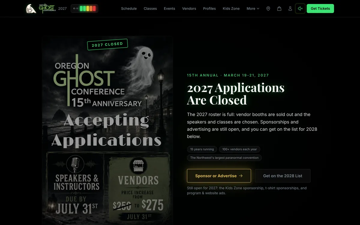
The native form stores its answers keyed by the original Google question titles, on purpose. Every screen and parser downstream works the same no matter which door someone used. When 2027 applications closed in August, the native form became the official intake, and today it’s the door for the sponsorships and ads that are still open. The cutover for 2028 is a setting, not a project.
A contract test runs on every build: if a field title on the form ever stops matching what the server expects, or a price is missing from the backup price table, the build fails. That test exists because a missing entry in that backup table would once have quoted a sponsorship at $0 on the application (more on that in What Broke).
One application, many decisions
The old way, one application was one yes or no. But real applications aren’t one thing. A single person might want a booth, a Main Stage talk, two classes, and a T-shirt sponsorship. The committee wants to say yes to the booth, waitlist one class, and pass on the other.
So Mission Control splits every application into line items: the booth, the talk, each class on its own, and every sponsorship or ad spot as its own line with the quantity and price the applicant was quoted. Nothing gets dropped. Anything the parser can’t classify still shows up as its own item so a person can decide it.
Each item gets its own decision: approve, waitlist, decline, or “more info”. And every decision is a draft. Early on, an Approve click was instantly live and permanent, and one misclick taught us that was a bad idea. Now nothing is real until someone presses Publish decisions.
A few things happen on their own while the committee decides:
- The oversell guard. Every sponsorship approval has to name a real spot on the rate card. If approving it would sell more than exist, the approval is refused, with a note telling the operator to raise the capacity if they really are selling more. Approvals also count down the “spots left” badges on the public apply page on the next page load.
- Duplicates, crossings, and returning businesses. A business with three people applying shows up as one crossing, not three strangers. A returning vendor gets matched to last year’s page instead of getting a twin. When their new answers differ from their live profile, the screen shows both and one tap takes the new value. It never overwrites blindly.
- People who apply by phone or DM get entered as a normal application, so they go through the same pipe as everyone else.
Publish decisions: the hinge
Publishing is the moment a decision becomes real. It does two things at once, and sets up a third:
- It writes the applicant’s email. One summary email per person, assembled from a library of paragraphs: a thank-you first, one paragraph per item (booth approved with the fee, class waitlisted, talk declined), payment and next steps, and a warm close. The subject line is picked by the mix of outcomes. It’s a draft. A person reads it, can edit it or attach a press kit, and presses Send. Nothing in this system emails an applicant about a decision on its own. The committee and I locked that rule in at a planning call, and it was the right call.
- It guarantees a profile page exists. If the person doesn’t have a public profile yet, one gets created as a draft, filled from their own application: their name and business, their third-person bio, website, social links, products, and every role they earned. If they’re a returning business, the existing page gets adopted instead of duplicated.
- It lines up approved classes and talks for the schedule. They appear in an “incoming” lane on the Classes board, and one click (or one “Add all”) turns each into a draft session that carries its own copy of the description, length, and outcome from the application, so the class page writes itself.
And once the email has gone out, you can’t un-publish. The system says it plainly: un-publishing would not un-tell them.
The profile: draft to finished
The committee finishes each page in Mission Control: picks photos (the applicant’s own uploads are already there to choose from), sets the category, booth number, and roles, and decides when it’s ready. Every save is logged with a before-and-after, and an undo button reverses the newest change without destroying the history.
Two of my favorite details live here:
Approving is not announcing. Speakers and instructors get approved weeks before the lineup is announced. So their roles are born “held”. A paid sponsor can go live with their sponsor tile today, while their class and talk wait for the founder’s announcement day. On that day, someone unticks “held” and publishes. That one idea removed an entire category of “oops, that went public early”.
Bio clean-up, with receipts (built, switched off). Thin bios (“Crystals, books, shirts.”) are flagged. A clean-up button gathers only the applicant’s own publication-safe answers and the public text of the links they gave, asks an AI model for a short bio where every sentence cites which source it came from, and then a plain code check flags any number or name that doesn’t appear in a source. A person keeps it or throws it away. Nothing auto-publishes.
Publish to site: Mission Control commits to the public website
This is the strange, wonderful part. Mission Control doesn’t serve the public pages. The public site’s pages are static: every vendor, profile, speaker, and class page is built ahead of time, so nothing waits on a database when a page loads.
So when the committee presses Publish to site, Mission Control does what a developer would do:
- It gathers every profile and every published decision and works out each person’s public roles.
- It checks the money. A Sponsor tag, a sponsor tier tile, and a paid ad slot only publish once that item is marked paid or waived. It counts paid sponsorships independently and reports any mismatch in the response, the commit message, and the audit log.
- It asks the website what it’s allowed to write. It fetches the public site’s own content schema and refuses to write if any field isn’t declared, because the site’s build would reject the file and take the site down.
- It commits the file straight to the public site’s repository, under its own name.
- That commit triggers the site’s build pipeline, which runs its own gates (content schema, rate card identity, a guard against unpublished drafts) and deploys to Cloudflare.
From click to live page takes about one to two minutes. Mission Control has made that commit 185 times so far.
And because a green checkmark in Mission Control once hid a broken deploy for days, Mission Control now watches the build for the exact commit it made. If the public site stops publishing, every operator sees a red banner.
What the public sees
Approved contributors end up with real pages:
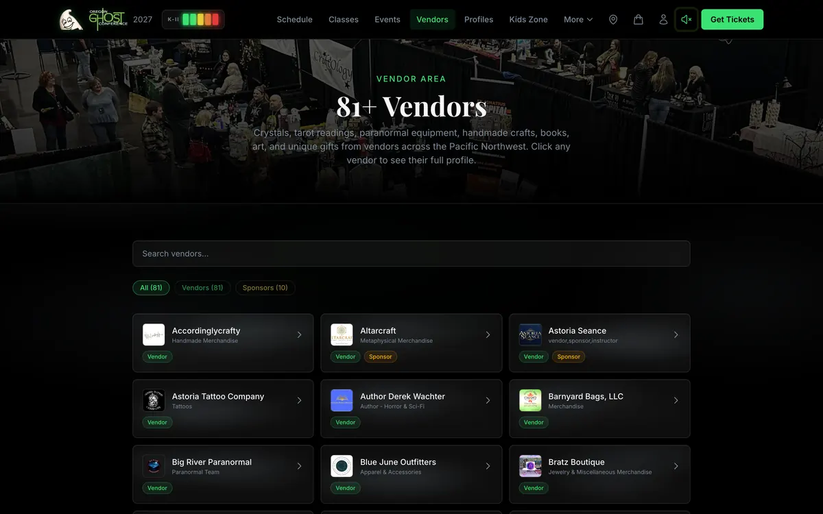
/vendors/: the vendor hall directory, searchable, filterable by vendor or sponsor./profiles/: a page about the person, with their own bio and every booth, class, and talk they’re doing, linked. Speaker and instructor applications had always asked for a personal bio. It just never went anywhere until this./speakers/and/classes/: the Main Stage talks and bookable class pages, once the program is announced.- The sponsor wall, with tiers derived from what was actually paid, not from a list someone keeps by hand.
The live site’s sitemap lists 213 public URLs today, including 87 profile pages and 85 vendor pages. Nobody typed those pages. They’re the exhaust of the pipeline. (Class and event pages stay out of the sitemap until the 2027 program is announced.)
Why it doesn’t break (much)
Plumbing is mostly about what happens when something goes wrong twice. Every boundary in this pipe has a rule:
| Boundary | What protects it |
|---|---|
| Form to Mission Control | Signed posts, dedupe by response, a retry if the check itself fails, a 10-minute backfill |
| Re-sent submissions | Merged, not replaced, with the audit row written first |
| ”We got it” emails | One per person per cycle, whichever door they used |
| Decisions | One per item, locked once published, oversell refused |
| Profiles | Matched before minted, fill-empty-only, a same-person check, a race guard |
| Decision emails | One live draft per application, a send that can’t happen twice |
| Site publish | No-op if nothing changed, schema check first, money reconciliation |
| Build | Content schema, rate card identity, and draft guards in CI |
| Deploy outcome | Watched by commit, red banner on failure |
Every one of those rows exists because of a real failure, which is the subject of a later section.
Email: The Part Nobody Sees Until It Breaks
Before Mission Control, the founder answered applicants one at a time. In a planning call, the founder described it plainly: copying, pasting, and sending each email by hand. Mission Control’s answer is to compose that email from the decisions, so the job becomes reviewing a draft instead of writing from scratch.
Email ended up being one of the deepest systems in the whole build, because it runs in both directions and it’s the one place a mistake reaches a real person instantly.
Outbound: what goes out on its own, and what never does
All conference email now goes out from the conference’s own address on its own domain, with proper authentication, through one sending provider. Getting there was its own small saga. For the first stretch, the site sent from a sandbox address that only delivers to the account owner, so every test “passed” because every test recipient was the owner. The rule that came out of it: email isn’t verified until a real message lands in a mailbox you don’t own, on a different domain.
Here’s the split that matters:
| Who triggers it | |
|---|---|
| ”We got your application” | Automatic, once per person per cycle |
| ”Finish your application” (abandoned form) | Automatic, once, after a day |
| Prep checklist for people not ready to apply | Automatic, right away |
| The applicant’s decision email | A human, every time |
| Replies to applicants and vendors | A human (Mission Control can reply in the thread) |
| Ticket confirmations, gift tickets, door receipts | Automatic |
| Class reminders the day before and right before | Automatic, asleep until conference week |
| Cart recovery, weekend-ahead, review requests | Built, tested, switched off |
The decision email is the one with a person in the loop on purpose. The composer writes it; a human reads it, edits it if they want, attaches a press kit or a schedule screenshot, and clicks Send behind a confirm box that says it delivers one real email.
Two small details I love: the email’s header and buttons are images, because Gmail’s dark mode recolors CSS but never images, so the conference’s electric green survives on every phone. And the sender name leads with “OGC”, because a phone shows about 20 characters of sender name and “Oregon Ghost Conference” was getting cut to “OREGON”.
A send button that cannot send twice
Double-sending an acceptance email sounds harmless. Double-sending one that says “you’re approved, here’s your fee” is not. So the Send button sits on top of a small state machine:
- Every email has a fingerprint. A hash of the draft, the recipient, the subject, the body, and the attachments. That one value becomes both the sending provider’s duplicate-protection key and the email’s own message ID. A crashed retry of the same content reuses both. Any edit makes a new fingerprint.
- It checks whether it already went out. If a message with that exact ID is already in the conversation, the email was sent and only the “sent” mark got lost. The system repairs the mark and sends nothing.
- Unknown does not send. A timeout or a server error doesn’t prove the email didn’t go out. So an ambiguous failure keeps the gate shut. The way out is to edit the draft, even by one space, which by definition makes it a new message.
- The database is the referee. Only one request at a time can hold the right to send a draft, timed by the database’s clock, not the app’s.
That design went through about 23 rounds with an adversarial AI reviewer before it shipped. It found real holes, like two different emails that could have shared one duplicate key, so the second one would silently never send.
Inbound: forward first, think second
Inbound mail is the scary direction. If the system eats a vendor’s question, nobody knows it was ever asked.
So the rule is: a human inbox gets the email first. Mission Control gets a copy second. Every address on the conference domain lands on a small Cloudflare email worker that forwards the message to a real inbox before it does anything else. If that forward fails, it tries a second person’s inbox. Only after the mail is safe does the worker send a signed copy into Mission Control.
An earlier design without the forward step got blocked in review, because it would have made the dashboard a single point of failure for a real business’s mail. The working phrase became: the inbox is a safety net, not a component.
Inside Mission Control:
- Replies find their application. First by the email’s own reply headers, then by the sender’s address, and if one sender has two applications, it refuses to guess and files it as unassigned. Nothing is ever dropped.
- One conversation per application, enforced by the database, not by hope.
- “Waiting on us” is a tab and a badge: open conversations where the last message came from outside.
- The never-replied list: applicants whose decision went out three or more days ago with no answer yet, oldest first. A follow-up list that gets generated instead of remembered.
- Quoted history folds away. The first real reply through the system was 471 characters, of which 40 were new.
- Seasons fold themselves. On April 1, last year’s conversations collapse on their own. No archive button to forget.
Nobody on the committee has to know any of that.
The Domain Trap (and 555 Old URLs)
Here’s an SEO lesson that surprised me.
The new site was better built in every way I could check. It didn’t matter yet. At our July baseline audit, the new site appeared in 0 of 16 test searches, because all of the search equity still lived on the old domain setup: the brand rankings, fourteen years of press mentions, and a #2 national ranking for “ghost conference” on the old site. A brand-new site can’t out-content fourteen years of history in a few months.
So instead of racing it, we treated the cutover as one gating move: move the real domain to the new site, carefully, all at once, and inherit everything.
The website side of it went smoothly because the hard part was done on day one. Every canonical tag, the sitemap, and the structured data had pointed at the real domain from the very first build, so the cutover only had to change DNS, not code. The new domain was attached to the hosting before the switch, so the security certificate was ready the moment the switch landed. The cutover happened on July 31.
Then came the old URLs. Fourteen years of a site means fourteen years of links: in print, in old Facebook posts, in other people’s websites. We pulled every URL the old site had ever published from the web archive, from 2018 to 2026: 555 of them. 53 got mapped to the exact class or event page that replaced them, 91 to the right category page, and the rest to the closest hub.
And then the trap inside the trap: Cloudflare Pages caps how many redirect rules of that kind it will honor, and past the cap it ignores them silently. An identical rule worked at one line of the file and returned a 404 ten lines further down, with no error anywhere. So the full 555-entry map moved into a small function that runs in front of every request, fails open if anything goes wrong, and catches case variations too.
What came next:
- AI-style search answers. Our audits score whether AI-style search answers name the conference, on a 20-point scale. At the July baseline it was 0. In the first audit after the cutover it was the full 20: a sampled search for “what is the biggest paranormal conference” named the Oregon Ghost Conference. One sample isn’t a trend, so the next audit asked four target questions. The conference was named in three.
- Search. In a US Google search on October 6, the site was the first organic result for “ghost conference” and for “ghost conference oregon”.
- Plumbing for machines. Structured data for the event (dates, the venue, the $30 ticket offer), the organization, and the website; an
llms.txtfile that gives AI answer engines the canonical facts; and a robots file that welcomes AI crawlers instead of blocking them.
If you’re rebuilding a site with real history, don’t start a new domain and hope. Point everything at the real domain from day one, move it in one careful step, and map every old URL you can find.
One more thing worth knowing if you run an event: search demand for this conference’s name runs more than ten times higher in its conference month than in the summer months. Public keyword data shows the same March spike four years running. Your site has to be ready for the spike before the spike.
How It Got Built: One Person and an AI Team
The split of work matters as much as anything in this post. I made the taste calls, the scope calls, and the business calls: which design direction, what’s in and what’s out, how refunds work, what the committee does by hand this year, and what an AI is never allowed to do. The AI team did the building, and then the checking, before anything got in front of the client.
Here’s what that looked like in practice.
A lead agent that owns the keys. One lead agent owns every merge and every production deploy. Builders work in their own copies of the code on their own branches, and nothing reaches the live site except through the lead.
Parallel builds with contracts. In early July, every tab in Mission Control got rebuilt in four days by 14 parallel build streams (a foundation stream, 12 feature streams, and an integration stream), each in its own workspace with its own preview site, all governed by one contracts document: who owns which files and tables, database changes are additive only, the money path is read-only for everyone, and every stream passes the same QA gate (a clean build, screenshots at desktop and phone size that the agent actually looks at, and functional proof, not self-attestation). An integration stream merged 12 pull requests, captured 60 screenshots across admin, committee, and vendor views with zero server errors, and owned the only production deploy.
Then on September 22, a lead agent and eight parallel builders shipped the door register, the new apparition clock, the cross-screen ghost, profile banners, printable rosters, and five switched-off extras. That was 122 commits across both repos (65 of them substantive), from mid-afternoon into the night.
Adversarial review from a different model family. Anything touching money, email, or identity went to a reviewer from a different AI model family whose only job was to break it, round after round, until it allowed the change:
| Work | Review rounds |
|---|---|
| The purchase flow | 12 |
| Per-seat tickets and gifting | 8, plus a second-model gate |
| The copilot’s knowledge base | 6 |
| The email router and send machine | 23 |
| The door register | 2 independent rounds |
Cold tests. Site Builder version two was tested by a fresh AI session that never saw it being built, working from a written test request. 156 checks passed, and it filed 10 findings.
Meetings become ledgers. The planning calls with the committee were recorded, transcribed, and turned into requirements ledgers where every item is tagged agreed, open, or mine, with a timestamp. When my bullet-point memory of a meeting disagreed with the transcript, the transcript won. The fixes from the biggest meetings often shipped the same night.
QA that stays. 66 QA and test scripts live in the two repos, not in a temp folder, because a QA tool that lives in a scratch folder dies with the session.
Human gates. Client email is drafted by the AI and sent by me. Since July, every decision email to an applicant is sent by a person. Real-card payment tests are mine. No AI is allowed to change those lines.
If you want the rules that keep that whole team honest, I wrote them up in the harness.
What Broke
A case study with nothing broken is a brochure. Every rule in this system exists because something went wrong first. Here are the ones that taught me the most.
Curly quotes made applications vanish. Early in the application cycle, about 20 of 22 real applications never reached Mission Control. The form script was signing each submission in a way that mangled anything outside basic ASCII, and phone keyboards type curly quotes and accented letters, so almost every phone submission failed its signature check and was dropped without a sound. Every test had passed, because test text is typed on a laptop. The fix: sign the real bytes, recover every missing application, and add the ten-minute safety net. The rule: test with the text real people actually type.
Every email only reached me. For the first stretch, transactional email went out from a sandbox address that only delivers to the account owner. Every test passed, because I was the tester. The rule: email isn’t verified until it lands in a mailbox you don’t own.
“Are you even testing this shit?” That’s me, in June, after being told three times that Mission Control’s phone menu was fixed and passing 15 out of 15 checks. It wasn’t. The menu sat underneath its own dimmed backdrop, and the automated tests were clicking it in a way no finger ever could. It got fixed only after testing switched to real taps on the real Safari engine. The rule: when the person says it’s broken and the tests say it’s fine, the tests are wrong.
A dedupe check that couldn’t answer. One brief database hiccup made a duplicate check fail, the failure was read as “not seen yet”, and the ten-minute safety net re-sent one application again and again, and the “we received it” email went with it. The rule: a duplicate check that can’t answer must stop everything, not guess.
Publish said yes, the site said no. For a stretch in late July, every “Publish to site” committed perfectly and never reached the live site, because the site’s own build was rejecting two new fields. Mission Control only knew the commit had worked, so it reported success. Now it asks the site what fields it accepts before writing, and watches the real build afterward.
Twenty-one rounds guarding the copy. The email router went through 23 adversarial review rounds. Round 21 found the best bug of the bunch: the worker read the entire incoming message into memory before forwarding it to a human. If that read failed, the conference would have lost the email outright. Twenty rounds had gone into protecting Mission Control’s copy while the original was at risk one line above. Now it forwards first.
A shared website isn’t a shared identity. The matcher that recognizes returning businesses passed 49 tests, then, on a dry run over real data, wanted to merge two different paranormal groups that share one web domain. Later, a class almost landed on the wrong co-founder’s page for the same reason. The rule: any “these are the same thing” logic gets a dry run on the real data before it ships.
An hour the type checker couldn’t see. A scoping mistake broke the application pages for about an hour. The build passed. The type check passed, because it doesn’t read that part of the file. The rule: load the built page under the real runtime before deploying.
A $0 sponsorship quote that almost shipped. Pricing lived in several places. One was a backup price table used only if the live price lookup failed, and nothing tested it. An adversarial review caught that a missed entry there would have quoted a sponsorship at $0 on the application, with every check green. Now a contract test fails the build if that table is ever incomplete.
The fix was the plan, not the code. In July, people started getting “Worker exceeded resource limits” errors and couldn’t get back in. After containing it, the root cause turned out to be the hosting plan’s CPU cap per request. A controlled before-and-after proved the upgrade moved the limit, and the errors went to zero. Sometimes the bug isn’t in your code at all.
The survey store that was never empty. For a month, sessions believed the survey data store was empty. It held 130 entries. The command-line tool was quietly reading a local copy. Two re-checks “confirmed” it by running the same broken command. The rule: when you re-verify, change the method. And when evidence contradicts itself, suspect the measuring instrument first.
The Numbers
All counted on October 5, 2026, from the two git repositories and the live database.
| Commits | 1,421 (949 public site, 472 Mission Control) |
| Days with commits | 68 on the site, 58 on Mission Control, 85 across both |
| Commits made by Mission Control’s publish buttons | 208 of the public site’s 949 (plus 10 Site Builder test publishes) |
| Substantive commits (no merges, journal hooks, sync snapshots, or bot publishes) | 851 |
| Biggest day | September 22: 122 commits across both repos (65 substantive), one lead agent and eight builders |
| Mission Control | 50 screens, 146 API endpoints, about 71,000 lines of source |
| Public site | 291 built pages, 29 serverless functions, about 28,000 lines of source |
| Database | 71 conference tables, 3,900+ audited writes |
| Profiles published | 85 live on the public site |
| Publish-to-site commits | 185 profile publishes, plus schedule, staff, and ad publishes |
| Copilot knowledge base | 928 passages, 11 read-only tools, 12 guided walkthroughs |
| Flyer backgrounds | 215 (105 active) |
| Vendor research agents | 81, in batches of 10, 20, 20, and 31 |
| Adversarial review rounds | 12 on payments, 23 on email, plus copilot and door register |
| QA and test scripts | 24 on the site, 42 in Mission Control |
A note on the commit count, because honesty matters more than a big number: about 440 of the public site’s commits were made by machines, either a journal hook that logs each session or Mission Control’s own publish buttons. Take those out, along with merges, sync snapshots, and Mission Control’s own hook and build-feed commits, and you get 851 substantive commits across both repos: real changes, made by an AI team I was directing.
What Any Event Organizer Should Steal
You don’t need a 50-screen back office to use any of these. Each one works on its own.
- Own your checkout. Your ticket buyers are your list. A checkout on your own site, with a real cart, is the difference between a transaction and a relationship. If you want to see what platform fees cost you over a year, the Ticket Fee Calculator does the math.
- Migrate the experience first, the money second. Build the new front end so it works with your old system. Then switching is a setting, not a gamble.
- Split every application into decisions. One person can be a yes, a waitlist, and a no at the same time. Your tools should let them be.
- Approving is not announcing. Keep “we said yes” and “we told the world” as two separate switches.
- Make every approval end in a page. If a person is part of your event, they get a public page about them, built from what they already told you.
- Put an address on every room. Wayfinding sounds small until you picture a first-timer hunting for an off-site venue in the dark.
- Give your committee one dashboard. If the event only works because one person remembers everything, the event has a single point of failure.
- Let a human send the important emails. Automate the drafting. Keep a person on the Send button for anything that tells someone yes or no.
- Forward first. Any system that touches your email should put it in a human inbox before it does anything clever.
- Turn surveys into rules. A survey that doesn’t change something next year is a form, not feedback.
- Build the extras switched off. Ship the code behind a switch, so turning a feature on is a decision, not a deploy.
- Test on bad Wi-Fi and real phones. Your attendees are in hotel rooms and convention halls, typing with their thumbs.
- Give it a personality. Nobody tells their friends about a schedule page. They tell them about the ghost.
I appreciate you taking the time to read how this one came together. If you run an event and want your website to do more than list the schedule, take a look at event websites, read the event website pillar guide, or book a call from the home page. You can see the live site at oregonghostconference.com. Stay a few minutes. Something might show up.
Quick answers
What was built for the Oregon Ghost Conference? +
A new public website and a second, private web app called Mission Control. The public site sells tickets and classes through its own cart, gives attendees a passwordless portal with QR passes, and gives every approved contributor a profile page. Mission Control handles applications, approvals, profiles, and publishing to the public site, and holds the tools for the vendor hall, scheduling, check-in, a door register, press kits, surveys, payouts, and the conference's inbound email.
What is Mission Control? +
Mission Control is the conference committee's private web app: 50 screens and 146 API endpoints that run the event's operations. It shares a database with the public site and commits data such as profiles, the schedule, staff bios, and ads straight to the public site's repository, which rebuilds and goes live in about one to two minutes.
How does an approved application become a public profile page? +
The committee decides each item on an application separately, then publishes the decisions. Publishing composes the applicant's email as a draft and creates a draft profile filled from the application. When the committee presses Publish to site, Mission Control checks payments and the site's content schema, commits the profile data to the public site, and the site rebuilds and deploys automatically.
How do you replace an event booking platform without losing sales? +
Build your own cart and checkout as a front end that can sit in front of either the old platform or the new payment processor, run both side by side, test in test mode, then move the money to your own payment account before the first real sale. The Oregon Ghost Conference moved this way from an outside booking platform to its own Stripe checkout between April and August 2026.
Can a small event take Tap to Pay at the door without card-reader hardware? +
Yes, by design. The conference's door register, built for the 2027 conference, lets a volunteer take a tap payment in Stripe's own phone app, then claims that exact payment in the register by time window, exact amount, and the card's last four digits. The database allows each payment to be claimed once, and the seat is held from the moment the tap starts. Real-device testing comes before conference week.
Does the AI assistant in Mission Control change any data? +
No. The Ops Copilot is read-only by design. It answers questions about the conference's live data, searches a knowledge base, drafts text for a person to send, and walks people through tasks by highlighting the real buttons on the page, but it does not send email, edit records, touch money, or deploy anything.
How can the founder edit the website without a developer? +
Through Site Builder in Mission Control: either by chatting with an AI agent that asks clarifying questions, shows a plan, builds a private preview, and publishes only on approval, or by editing page text directly in forms. Every change can be undone, including after it is published, and protected files like payment code and the application form are off-limits.
What should a post-event survey do? +
Change something. Mission Control groups survey answers into topics like pain points, suggestions, and wins, with verbatim quotes. At the Oregon Ghost Conference, attendee complaints about overlapping sessions became a 10-minute buffer rule built into every class-time save.
How long did the Oregon Ghost Conference build take? +
About six months. The first build session was March 17, 2026, Mission Control's first commit was May 5, and both were still shipping at the end of September: 1,421 commits across the two repositories on 85 different days.
What tech stack runs the Oregon Ghost Conference website? +
Astro on Cloudflare Pages, Supabase for the database and 29 serverless functions, Stripe for payments, Resend for email, Cloudflare Email Routing with a custom worker for inbound mail, a Git-based CMS, and Claude models inside Mission Control for the assistant, survey analysis, and the AI website editor.
Keep reading
- How I Built a Full Website in 30 Hours (After Failing Spectacularly the First Time)I spent two weeks planning a website with Claude before writing a single line of code. Then I built it in 30 hours across one weekend. But the real story isn't the build weekend - it's the complete failure that forced me to rethink how I work with AI from the ground up.
- Six Months Building an App With AI (And Why I Pulled It From Review Myself)The first session had a deadline in it: get into the App Store by March 27. Six months later Tarotdoxa has four codebases, 539 iOS tests, two Apple rejections, a Google approval it's still sitting on, and a build I pulled out of review myself. Here's how building an app with AI actually went.
- How To Use Sales Strategy When Thinking About Design (And How AI Made It Possible)Sales instincts built over 20 years quietly shaped every design decision on generussdesign.com. This is the methodology behind the collaboration, and why systems thinking compressed through AI created something I couldn't have built alone.